Ironing Service Flyer Design Guide That Gets Calls In
This is some text inside of a div block.


Only 52% of women in Singapore said they had enough personal time for their physical, mental, and emotional well-being, according to Ipsos' 2021 study on unpaid domestic and care work, while laundry still sat firmly inside the gendered household routine. That's the opening for an ironing service flyer in Singapore, because the buyer is rarely thinking about one shirt on the board. They're thinking about the weekend pile, the hanger rod, the drying rack, the uniform shirts, and the space they don't have to keep all of it moving.
The strongest reason a flyer still works is simple. The job is physical. In Singapore homes, laundry is not just pressing clothes, it includes washing, sorting, hanging, folding, moving items around the flat, and putting them away again. A Singapore-facing estimate says a family of four can spend about 8 to 10 hours a week on laundry tasks including hanging and folding, which makes the flyer's job clear, it has to sell back time, not just a smoother collar source.
A flyer that leads with “cheap ironing” often misses the point in letterboxes and noticeboards. The person flipping through a stack of ads wants a fast answer to a messy household problem, not another service description. If the flyer speaks to closet-ready garments, hanger delivery, and fewer steps between wash and wear, it feels closer to daily life.
The Singapore context supports that framing. Ipsos found that close to 9 in 10 Singaporeans agreed chores can be equally shared by husband and wife, yet practical responsibility still leaned towards women, especially for cleaning, laundry, cooking, and grocery purchases Ipsos Singapore study. That gap between belief and workload is where a flyer can land. It does not need to argue about fairness, it needs to promise a cleaner handoff.
Practical rule: if your flyer sounds like a press machine advertisement, it is too narrow. If it sounds like a household time-saver, it starts to feel relevant.
For operators who want the same offer to work in print and online, the flyer can be the base asset, then the same core promise can support a Facebook campaign. A guide to grow your service business on Facebook helps shape that digital follow-on without drifting into laundry jargon.
That logic also fits an ironing service from home framing. The service reads better when it is tied to domestic convenience, not treated as a standalone chore. In flats where space is tight and the drying rack is always in the way, the flyer should make the reader feel that ironing is part of a wider cleanup of household friction.
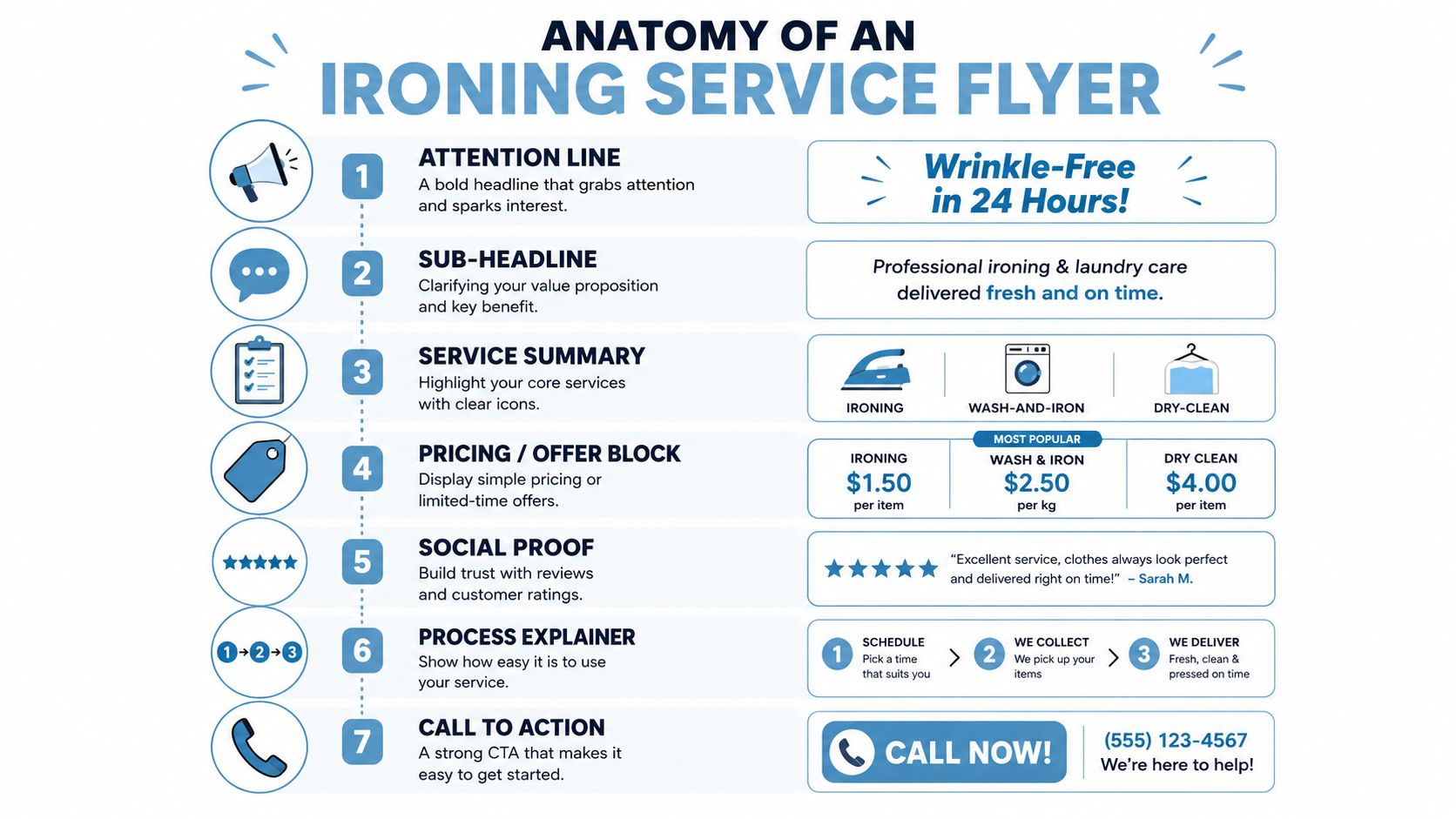
A flyer has to answer four questions almost immediately, who are you, what do you do, why should I care, and how do I book. Everything else sits underneath those four answers. The best layout makes each answer visible in the first scan, instead of forcing the reader to hunt through a wall of text.
Start with an attention line that promises a result, not a process. The sub-headline should sharpen the promise, maybe by pointing to convenience, garment care, or pickup and delivery. Then move into a service summary that shows the actual options, such as ironing, wash-and-iron, or dry-clean support, so the reader can self-select without confusion.
The offer block needs visual weight because it's the decision trigger. If there's a price, bundle, or introductory hook, don't bury it. Put it where the eye lands after the headline, then support it with a social proof element, a short review cue, service history, or a trust marker. After that, a compact process explainer reduces friction by showing what happens next. End with one obvious call to action, such as WhatsApp, phone, or booking link.
A flyer works when the reader can mentally fill in the rest of the journey in under ten seconds.
That sequence matters because decision fatigue is real on paper too. Someone looking at a letterbox flyer doesn't want to decode a laundry menu before they understand the benefit. The job of each block is to reduce uncertainty in order, headline first, offer second, proof third, action last.
If you need a reference point for broader service presentation, Tumble's services page shows how a laundry business can separate cleaning, ironing, and garment care without making the customer guess what belongs where. On a flyer, that separation has to happen even faster, because the reader is moving.
Good flyer copy in Singapore sounds practical, not polished to the point of distance. It should read like someone who understands condo racks, school uniforms, office shirts, and weekend laundry overflow. The best lines are short because they do one job each, signal the outcome, frame the service, then remove doubt.
Flyer BlockAudienceSample CopyHeadlineBusy professionalsFreshly Ironed, Hanger-Ready, Delivered to Your DoorSub-headlineCondo familiesPickup and delivery for weekly laundry, ironing, and clean-and-iron careOffer blockPrice-sensitive householdsBundle your wash, press, and delivery in one simple orderHeadlineFormalwear customersCare for Shirts, Office Wear, and Delicate PiecesSub-headlineTraditional attire buyersItemised handling with care-label checks for clothes that need more than a quick pressOffer blockConvenience-first readersChoose iron-only, wash-and-iron, or clean-and-iron based on garment condition
The strongest line usually names the finish, not the machinery. “Wrinkle-free” and “ready to wear” are more useful than “professional ironing,” because the reader already knows they want clothes pressed. If the flyer is for working households, “hanger-ready” does more work than a generic promise of cleanliness. If the audience includes condo residents, “pickup and delivery” should sit near the headline, because convenience is part of the product.
For families who want more than a laundry brochure, the copy should address the hidden household burden. A link to clean and tidy thinking is useful here, because the flyer isn't only selling pressed clothes, it's helping the home feel less cluttered and less reactive.
The cleanest approach is to keep the headline outcome-led, the sub-headline service-led, and the offer block decision-led. That way the copy does not blur into one big promise. It moves the reader from “what is this” to “is this for me” without friction.
Iron-only is the right lead only when the garments are already clean, only lightly wrinkled, and the customer understands that pressing is the main problem. That's a narrower audience than most flyers assume. A more common buyer needs a workflow that handles fabric condition as well as wrinkle removal.
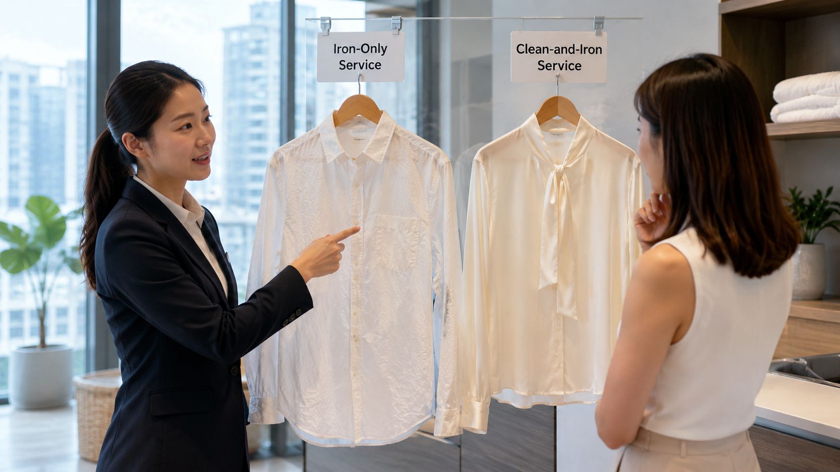
Singapore-facing guidance notes that ironing-only may still leave very wrinkled items looking imperfect, and that dry cleaning plus ironing can leave garments looking fresher and smoother. That matters for flyer hierarchy. If the customer's first thought is a badly creased office shirt or a formal piece that needs a better finish, the flyer should not pretend iron-only is enough. It should steer them towards the more suitable workflow.
The practical split comes down to garment state. If the item is clean, not too crushed, and the customer mainly wants shape restored, iron-only can sit as a simple entry offer. If the piece is heavily creased, delicate, or expected to look polished for work or events, the flyer should push clean-and-iron higher. That is where the promise becomes stronger and more believable.
Working rule: sell the service that matches the garment's condition, not the cheapest service on the menu.
This is also where the flyer can reduce complaints before they happen. A customer who understands that the finish depends on fabric type, dryness, and pressing method is less likely to feel surprised at delivery. That's why a flyer should explain the workflow in plain language, not just list products.
The fabric-angle version of this decision is already clear in the technical care guidance from earlier, so the flyer only needs a short reminder, inspect the garment, choose the right care path, then finish with the right heat and handling. If the buyer wants a broader garment-care explanation, a piece like steaming vs ironing which is better for your clothes helps frame that trade-off without overcomplicating the ad.
A flyer has only a short window to earn attention. The layout has to do the heavy lifting before the reader decides whether the service is worth a second look. If the eye has to hunt for the offer, the sheet is already too hard to scan.
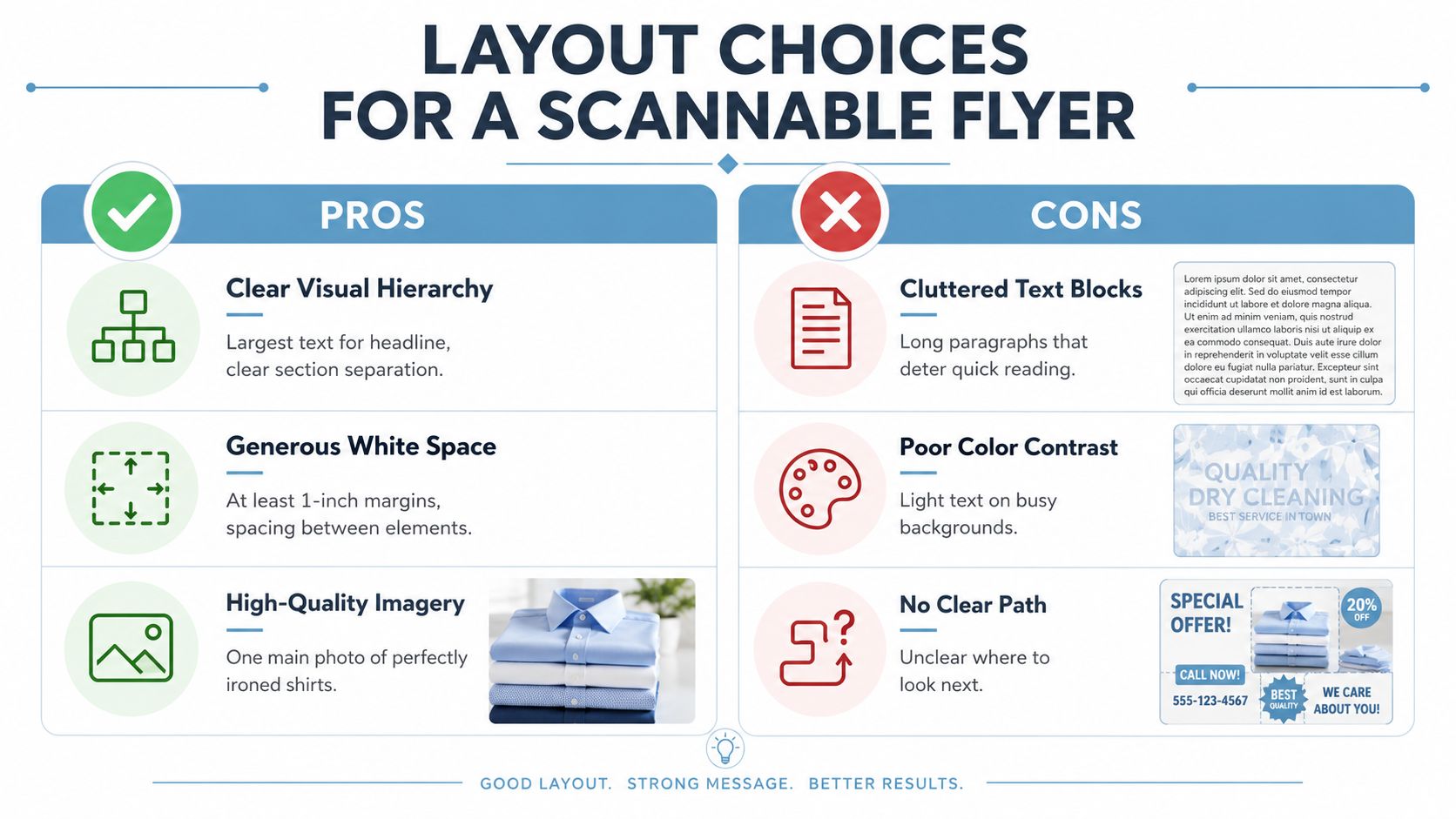
Use one main headline, one supporting image, and one clear action. That is enough for a flyer that may be glanced at in a lift lobby or at a letterbox. A crowded page can feel busy in the studio and unreadable in the corridor.
The visual treatment should match the message. If the flyer is selling garment care, show neatly pressed shirts or a clean folded finish, not a cluttered table of irons and props. If the copy needs more room, give it space. If the image already carries the message, tighten the text. Just as a well-organised wardrobe separates items by frequency of use, the flyer should separate high-priority and low-priority information by visual weight.
A bi-fold works best when each side has a job. The front panel should carry the headline, the main image, and the strongest offer. The inside or back panel can hold the process, trust cues, and contact details. On a single-sided A5, the hierarchy has to be sharper, so the CTA cannot sit at the bottom like an afterthought.
For print inspiration, a close look at pattern interruption in advertising is useful, because the flyer needs one visual break from the usual laundry template. That does not mean a gimmick. It means one element that stops the thumb and earns a second glance.
The embedded clip below is useful if you're comparing how video pace differs from print pacing.
A flyer also has to reflect how people buy laundry help. Working parents and condo residents often want one clear route from problem to outcome, and a practical promotion page like promotions should shape the same logic, one offer, one route, one response path.
A good flyer should not die on paper. The same headline, offer, and process can be repackaged for a square ad, a WhatsApp image, or a Telegram post without rewriting the whole message. That saves time and keeps the brand from sounding fragmented across channels.
The attention line becomes the hook image or opening frame. The offer block becomes the bold overlay on a square crop. The process explainer turns into a short carousel, with one card for pickup, one for cleaning and pressing, and one for delivery. That works better than trying to stuff every detail into one digital post.
For visuals, folded garments on hangers usually outperform stock photos of irons because the customer wants to see the result, not the tool. That's especially true in WhatsApp where people skim quickly and trust clarity over polish. A clean, recognisable laundry finish is easier to understand at a glance.
The CTA also changes by channel. On paper, a phone number or WhatsApp line has to be visible immediately. Online, the same offer can point to booking or enquiry flow, but the message should still stay simple. Don't create a new promise for each platform, just change the delivery format.
One practical model is to keep a single copy set for the flyer, then export one cut for HDB letterboxes, one for condo noticeboards, and one for Meta or WhatsApp. That prevents the offer from drifting. It also makes repeat testing easier because the core message stays constant.
Paper choice matters because flyers get handled, folded, and skipped past in a stack. If the stock feels flimsy, the offer looks disposable before anyone reads it. A slightly heavier sheet with a clean finish usually holds up better than the cheapest option.
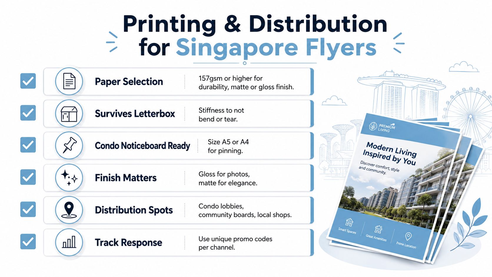
Matte finish suits text-led layouts because it cuts glare and keeps the offer readable under corridor lighting. Gloss works when the image carries the message, especially if folded shirts and hanger delivery visuals need to look crisp. Start with durability, then choose the finish.
A flyer should function like a wayfinding sign. The main offer must be readable at first glance, with pickup, ironing, and delivery details arranged in order of relevance so busy residents know what to do without scanning the whole page.
Distribution should match where laundry friction shows up. HDB letterbox drops work when the copy speaks to household load, condo noticeboards fit messages about convenience and space saving, and local partner placements, such as tailors or cafes, can catch people while clothing and routine are already top of mind. That is more practical than spreading the flyer everywhere and hoping for the best.
Printer coordination matters too. A tool like AI receptionist for print shops can help a printer handle enquiry volume without slowing simple reorders, which matters when you are testing different zones or versions. Faster reprints make it easier to improve the flyer instead of guessing.
For measurement, give each drop zone a unique promo code. Then compare which estate, condo cluster, or partner location brings enquiries. Treat the flyer as a trackable campaign, not a one-off handout. The best print job in Singapore is the one you can iterate on, assign unique promo codes to each drop zone, then reprint only the versions that generate enquiries.

We make laundry days fast and easy for you. We collect, clean and deliver your laundry and dry-cleaning.
53 Ubi Ave 1 #03-43, Singapore 408934
Mon - Fri | 8:30 am–5:30 pm
Sat | 8:30 am–12:30 pm
hello@tumble.sg
+65 62554222
Whatsapp Us


